
Lot #10 - Bridget Riley
-
Auction House:Deutscher and Hackett
-
Sale Name:Important Australian & International Art
-
Sale Date:28 Aug 2013 ~ 7pm
-
Lot #:10
-
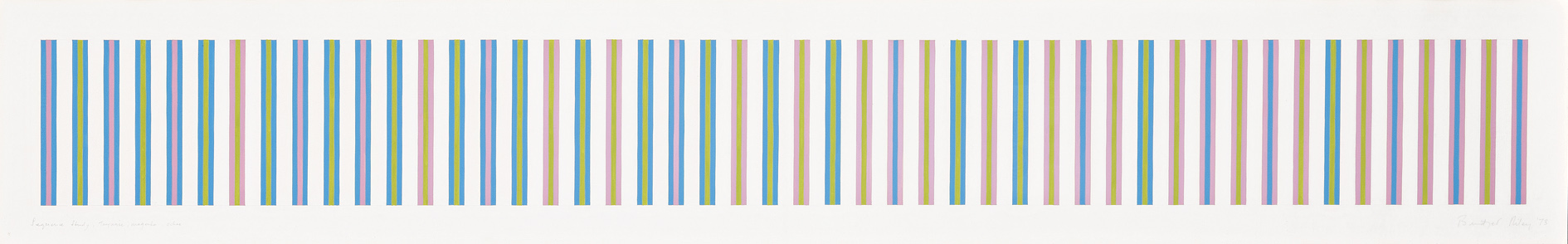
Lot Description:Bridget Riley
born 1931, British
Sequence Study 1, Turquoise, Magenta, Ochre, 1973
gouache on paper
30.5 x 191.0 cm
signed and dated lower right: Bridget Riley ’73; inscribed lower left: Sequence Study, Turquoise, magenta, ochre; bears inscription verso: CAT. / 86 -
Provenance:Collection of Lex Aitken and Alfredo (Bouret) Gonzalez, Sydney, acquired directly from the artist, c1973
-
Exhibited:Bridget Riley, Works 1959–78, British Council retrospective exhibition, Albright-Knox Art Gallery, Buffalo, New York, USA, 1 September – 8 October 1978; toured to Dallas Museum of Fine Art, Texas, USA, 25 October – 26 November 1978;; Neuberger Museum, New York, USA, 28 January – 18 March 1979;; Centrepoint Gallery Space, Sydney, Australia, 15 August – 16 September 1979;; Art Gallery of Western Australia, Perth, Australia, 4 October – 5 November 1979;; National Museum of Modern Art, T
-
References:Bridget Riley, Works 1959–78, British Council, London, 1978, cat. 86, p. 73 (as ‘Sequence Study 1: Turquoise, Magenta and Olive [sic]’, lent by Mr Lex Aitken)
-
Notes:‘You could say that change is consistent of colour, but in perception these changes do not take place as ruptures, nor are they in any sense rapid. They are shifts within a particular envelope. Every painting has its own character – its own “light”; it may be fresh, a shining sparkle or a yellow saturated glow, or even dusky mid-tone. But none of these qualities can be precisely nailed down any more than those of real daylight. They are unavoidably elusive.’ 1; ; Employing the repeated stripe motif witnessed in the previous colour compositions (lots 5–9), the present is similarly predicated upon the juxtaposition of a triad of colours in different sequences to precipitate colour reactions: again, two colours are nearly opposites (here magenta and turquoise) while the third is an adjacent (ochre) designed to shift the emphasis. A seemingly neutral vehicle which allows colour energies to develop uninhibitedly, this structural arrangement bears strong affinity with the aesthetic principles underlying the Zen gardens of Japan: main stone – counter stone – adjacent stones. 2 What remains certain however, is that Riley’s formal organisation does not derive from scientific knowledge or complex colour theories (despite her self-professed fascination with Seurat): as she vehemently maintains, ‘…my work has always developed on the basis of empirical analyses, and I have always believed that perception is the medium’. 3 Although perception remains the medium in her colour investigations, now the perception of colour serves increasingly to convey the perception of light. Thus, not surprisingly perhaps, it is in these colour compositions that the connection between her art and Nature culminates. No less abstract in formal terms than their monochrome counterparts, such works nevertheless exude an impression of heightened familiarity: as Riley muses, ‘colour inevitably leads you to the world outside.’ 4; ; 1. Riley, cited in ‘Into Colour: In Conversation with Robert Kudielka’ (1978), reprinted in Moorhouse, P., (ed.), Bridget Riley, Tate Publishing, London, 2003, p. 210; 2. Kudielka, R., ‘In Conversation with Robert Kudielka’ (1972), reprinted in Moorhouse, ibid., p. 208; 3. Riley, B., ‘Perception is the Medium’ (1965), reprinted in Moorhouse, ibid., p. 207; 4. Riley, cited in Riley, B., Bridget Riley: Dialogues on Art, Zwemmer, London, 1995, p. 70; ; VERONICA ANGELATOS
-
Estimate:A$40,000 - 60,000
-
Realised Price:
-
Category:Art
This Sale has been held and this item is no longer available. Details are provided for information purposes only.